

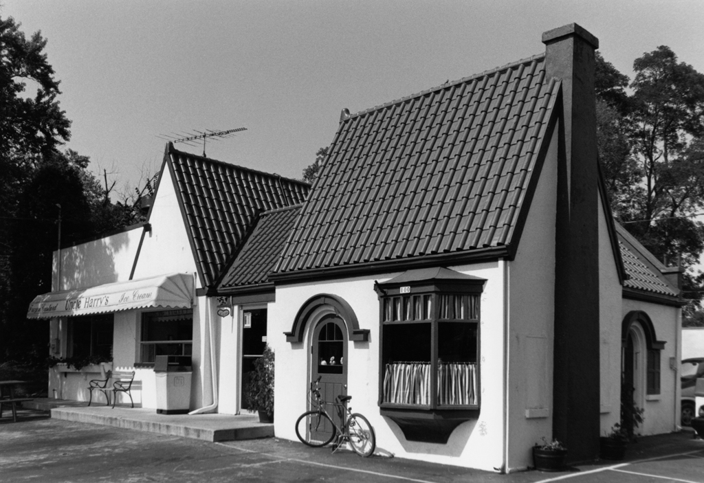
This little cottage illustrates a gas-station marketing strategy that emerged in the 1920s. Oil companies clamored to draw motorists’ attention by using distinctive signs, colors, and buildings. Ohio’s Pure Oil Company hired Petersen to devise a company station style. His English cottage design looked like a quaint house with an attached garage, intended to blend into nearby residential neighborhoods while also identifying this Pure Oil outlet. The cottages drew on the company’s colors: white walls and a steep, “Pure Oil blue” tiled roof (now red). From about 1925 through the 1940s, Pure built hundreds of these stations across the country. Waterford’s station, now a frozen custard and ice cream shop, with its two (now enclosed) service bays, looks like a house, complete with hood moldings over arched entries and an oriel window. A similar station stands in Monroe, at 1323 9th Street.
Uncle Harry’s (Pure Oil Service Station)
c. 1930, Carl August Petersen. 100 S. Jefferson St.