You are here
Wells Fargo Bank
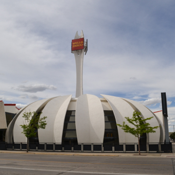
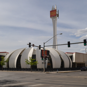
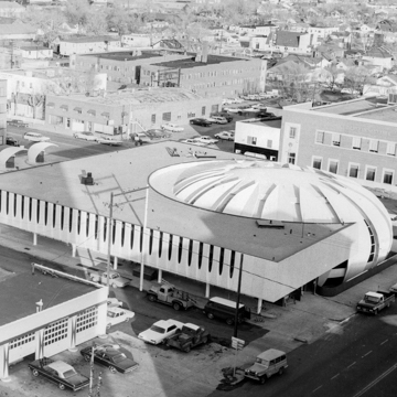
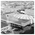
The new Wyoming National Bank building in downtown Casper opened to great fanfare in May 1964, during the height of an oil and gas boom. The bank was designed by Denver architect Charles Deaton, known for dramatic, sometimes futuristic, modernism. His work in Casper, was—and still is—unlike any other building in the city or the state. Designed “specifically to meet the bank’s needs” on its 50th anniversary, the main building is a sculptured rotunda placed at the carved out corner of a two-story block. The rotunda contains a two-story, domed banking lobby; the block building that surrounds it contains offices. Departing from the continuous street wall of traditional downtowns, the Wyoming National Bank is a free-standing structure, with no adjacent buildings or prominent entrance. The bank occupies a corner lot, but Deaton omitted the typical corner entrance in favor of two entrances, one from the sidewalk on the south side and one from the parking lot on the north—a dual orientation that was not unusual in commercial buildings of the period. The bank was designed with exterior walk-up teller windows and six separate, clamshell-shaped, drive-up booths arranged across the north end of the site, staffed by tellers who entered the booths through a tunnel from the main building. As the bank noted in a promotional brochure, “We believe our new building, with its adjacent free customer parking area and the modern drive-up banking windows, provides the ultimate in convenience and efficiency.”
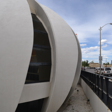
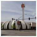
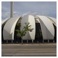
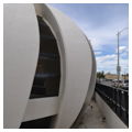
Deaton’s design was a departure from earlier Wyoming banks, whose architecture stressed tradition and solidity. Deaton called his approach “a sculptural concept in architecture,” but local residents dubbed the bank “the leafy rotunda” or “the peeled orange.” The playful, domed rotunda was formed by 17 large, leaf-like segments or “blades,” cast in concrete on site in a form built of wood and dirt dug from the basement, and tilted into place, arranged in a circular pattern. Each blade is 44 feet tall and weighs 21 tons; the 17 blades form an exterior skeleton from which intervening glass and steel panels are hung. The base of the rotunda is below grade and is revealed by a “sunken garden” between the building and the sidewalk. This emphasizes the sweep of the walls and allows light into the garden level.
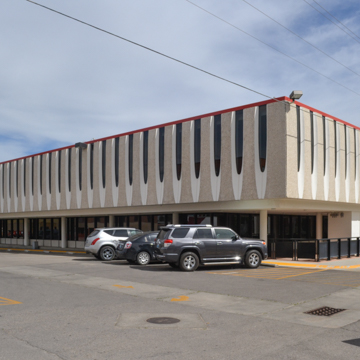
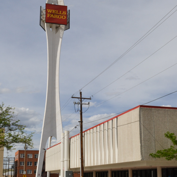
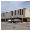
The square block that embraces the rotunda is heavily cantilevered on the north and west elevations so that it appears to float above the ground. Its upper story is covered with pre-cast concrete panels. The north and west walls were designed with a gentle outward curve that softens the square mass and helps blend it with the rotunda. These elevations are pierced by rows of narrow windows in sculptural reveals that appear to have been carved into the concrete panels.
The interior of the rotunda is a clear-span space 86 feet in diameter, which curves gently inward to a 60-foot-diameter ceiling. Overhead light was baffled using a specially designed “squiggle” plastic louver, the first installation of its kind according to the bank’s brochure. Originally, 20 teller booths were arranged in a semi-circle around the street sides of the building, leaving the center as a “comfortable waiting area.” Now the tellers are arranged in the center of the room, with benches for customers fit into the glass-lit spaces between the “petals” of the rotunda. A second-floor balcony encircles three-quarters of the space. The original ceiling has been replaced with a dropped ceiling.
Another lighting innovation was the ceiling of the board of directors’ room on the second floor of the office block, which used a light-diffusing system known as “Leaf-Lite” made from hundreds of metal leaves suspended from a grid. The bank featured a basement safe deposit vault with a massive 8-ton door designed by Deaton and constructed by Diebold, Inc., with a unique wedge lock operated by an electric timing device connected to a concealed alarm system.
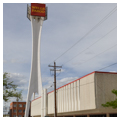
In 1968, a 177-foot-tall, free-standing “time-temperature pylon” was erected to the north of the bank building. The distinctive tower, possibly inspired by Seattle’s Space Needle, was built of sculptured steel painted white, designed to complement the design of the bank. The tower rises on three sculptured legs which come together about one-quarter of the way up to form the fins of a single shaft, then separate again at the top forming an oblong space that originally held the time-temperature sign. Each letter or numeral of the sign was 8 feet tall. The three faces of the upper portion of the tower are now covered with Wells Fargo signs. In 1974, a one-story, drive-through facility was added at the northwest corner of the property.
Wyoming National Bank changed hands several times during the 1980s and 1990s. Wells Fargo acquired the building in the mid-1990s. Although the original 1964 drive-up booths were demolished, the 1964 bank building and 1968 tower remain in close-to-original condition.
References
The Wyoming National Bank. “50 Years of Service to Central Wyoming.” Casper, WY, 1964. Casper College Western History Center.
Writing Credits
If SAH Archipedia has been useful to you, please consider supporting it.
SAH Archipedia tells the story of the United States through its buildings, landscapes, and cities. This freely available resource empowers the public with authoritative knowledge that deepens their understanding and appreciation of the built environment. But the Society of Architectural Historians, which created SAH Archipedia with University of Virginia Press, needs your support to maintain the high-caliber research, writing, photography, cartography, editing, design, and programming that make SAH Archipedia a trusted online resource available to all who value the history of place, heritage tourism, and learning.

